How to work a contemporary stripe
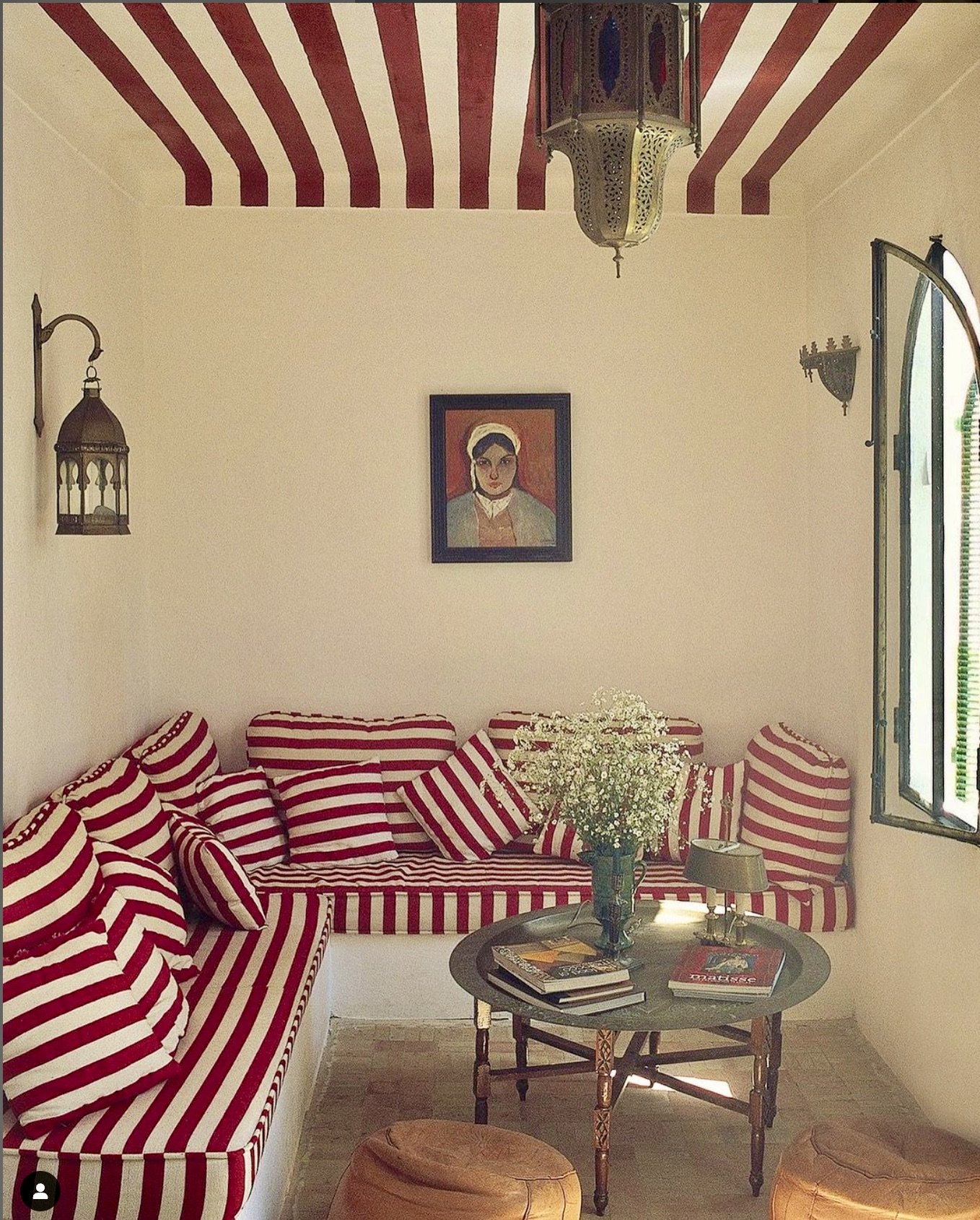
Gavin Houghton’s Tangier Riad / Photography Roland Beaufre
Stripes: Where tradition meets trend, the classic style is having a modern revival, let’s discuss how to work it in a contemporary way.
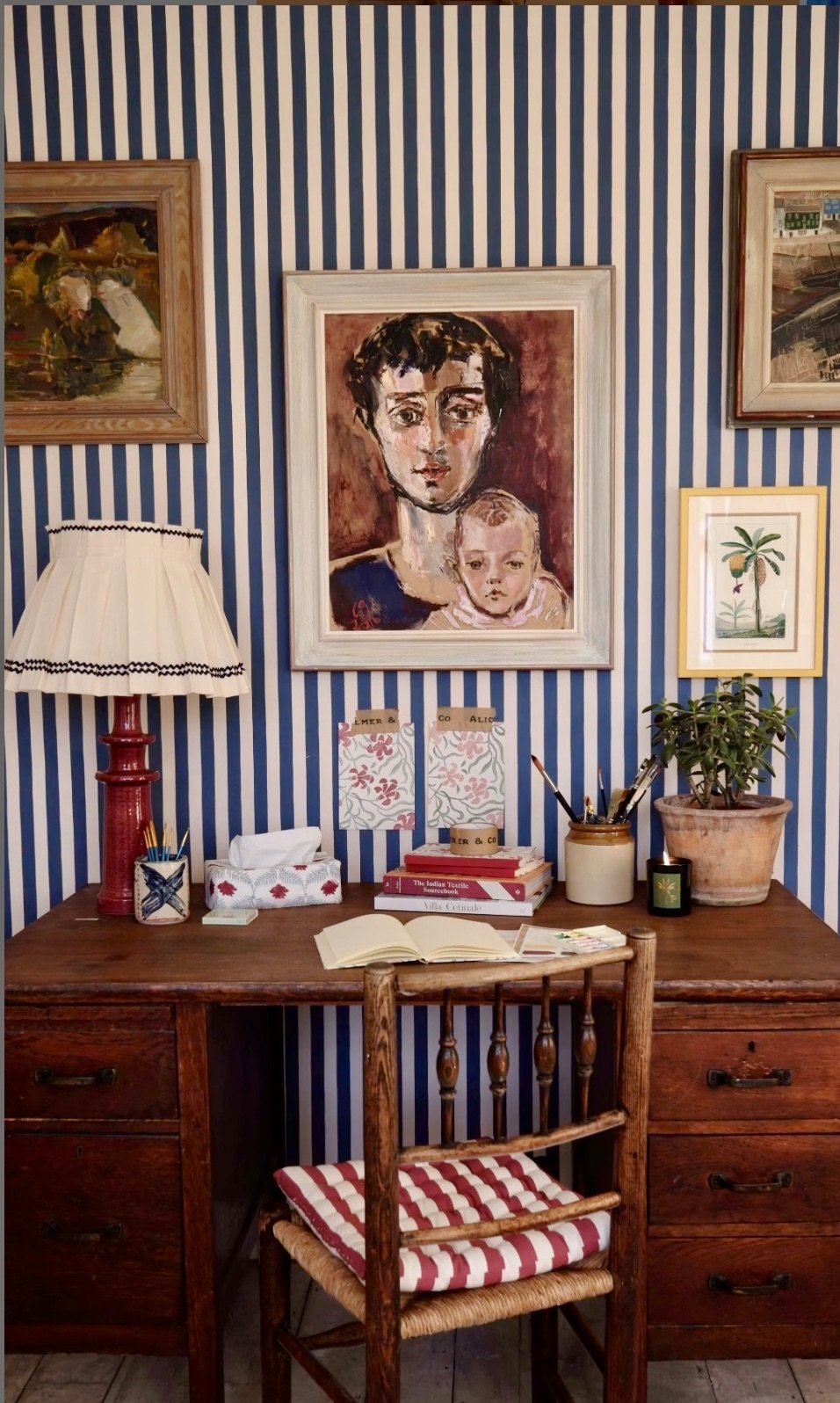
Having just come back from Chelsea Design week it seems I am surrounded by new and exciting stripes. The stripe is a graphic form which has the power to alter both the proportions and the feeling of a space. When used on the walls they change the proportion of a space, with the eye drawn to follow the direction of the line. Striped walls have elegant simplicity and can be seen as a neutral, if left blank however they can be overpowering. I think they are best used as a backdrop, I suggest adding art to break up the lines and create a layered scheme such as in this intriguing study below.
Alice Palmer wallpaper
However, I suggest you don’t use stripes on walls that are not flat, they will appear to bulge and the eye will be drawn to the curve, something to consider in period properties. Also be mindful of the pattern repeat so plan well before hand to make sure there are no odd intersections on either walls or furniture.
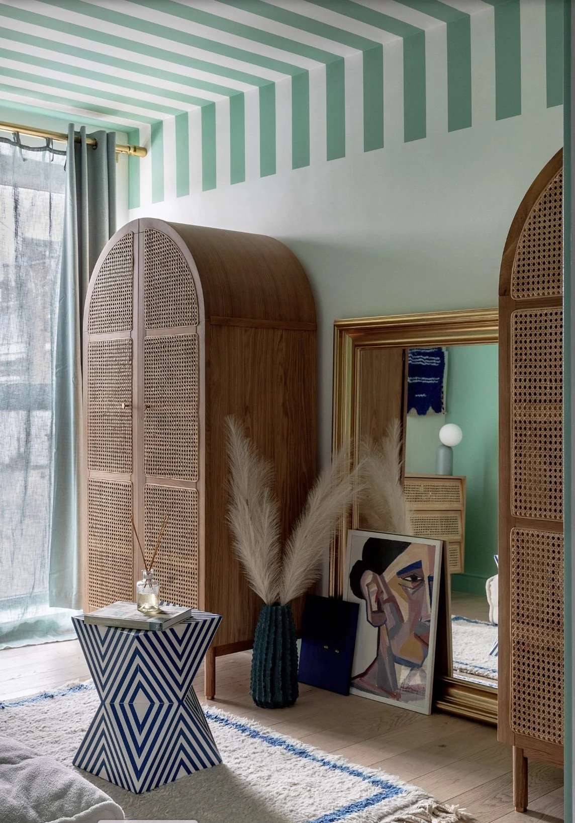
Striped ceilings can be great fun and a less obvious way to work the stripe. They can broaden a narrow room, on a pitched ceiling they create a tented feeling which could be great fun in a guest or child’s bedroom. A popular trick by designers is to extend the stripes down the wall to trick the eye into thinking that the room is larger than it actually is.
Striped ceiling by PL Studio
On the floor a stripe anchors a design and draws the eye down. Look at this image here of a fresh stripe in a period property, with high ceilings. The eye is drawn down and into the centre of the room with the smaller peices of furniture then anchored to it, they don’t look lost.
Carrier and Company
The scale of the stripe impacts the atmosphere whether used as a wallpaper or a fabric. Pinstripes are calm and elegant, ticking is fresh, relaxed and medium and thick stripes are bolder and more statement. They can be used to add drama, energy to embolden a design or to add contrast, tension to a more relaxed scheme. I like to mix the scale of stripes in a space so as not to feel too matchy. Don’t go overboard with stripes though, you don’t want to feel like you are in a jail!
Alice Palmer fabric and wallpaper
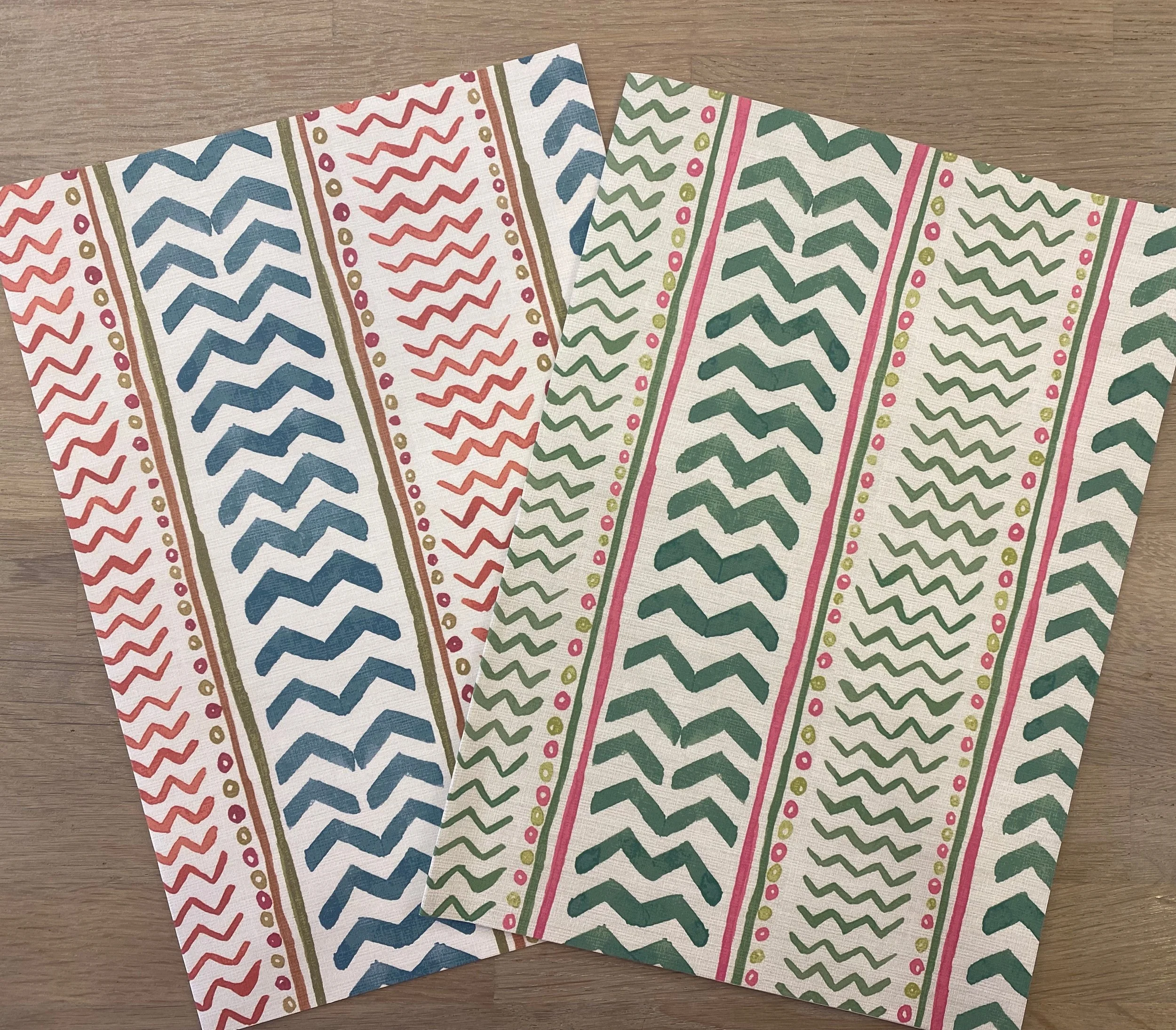
The colour of the stripes can make a scheme feel classic or contemporary. A fresh stripe is the easiest to work with such as in the image of the dog in a period property. It updates the space without being overwhelming. Although the more colours you use the more flexible the scheme. The new “Wriggle room” papers and fabric from Kit Kemp are a case in point.
Wriggle room wallpaper
Finally when it comes to pattern matching as it goes with everything. I love teaming it with an organic flowing pattern to create a counter point, where it adds strength, order and calmness.
If you would like help deploying a stripe at your home, get in touch!


